
General
Domains
- Home
- General
- Getting Started
- Previewing Your Design on Different Devices
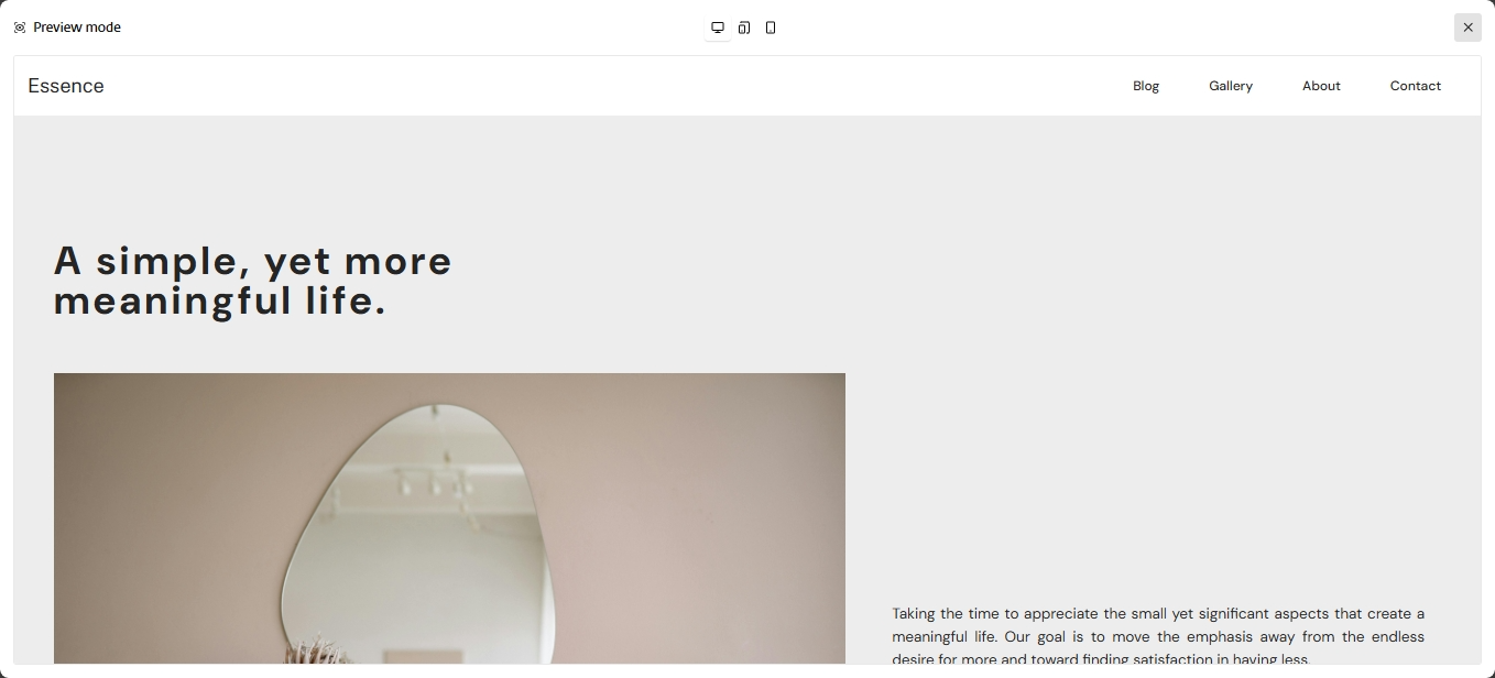
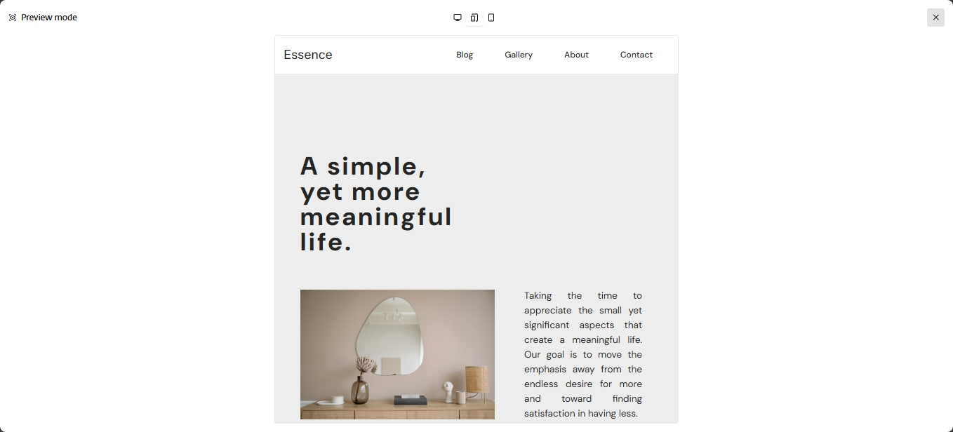
Previewing Your Design on Different Devices
Make sure your site looks great on all screens by previewing and adjusting it for desktop, tablet, and mobile views.
Preview Your Site on Multiple Devices
Use the device preview buttons in the editor to switch between views:
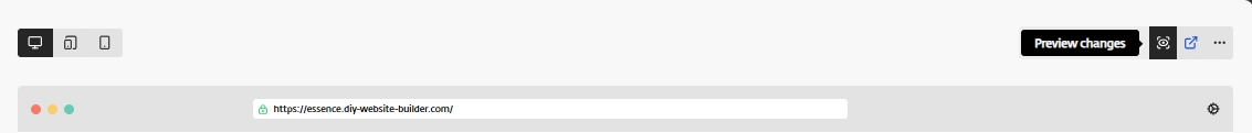
- Desktop View
- Tablet View
- Mobile View
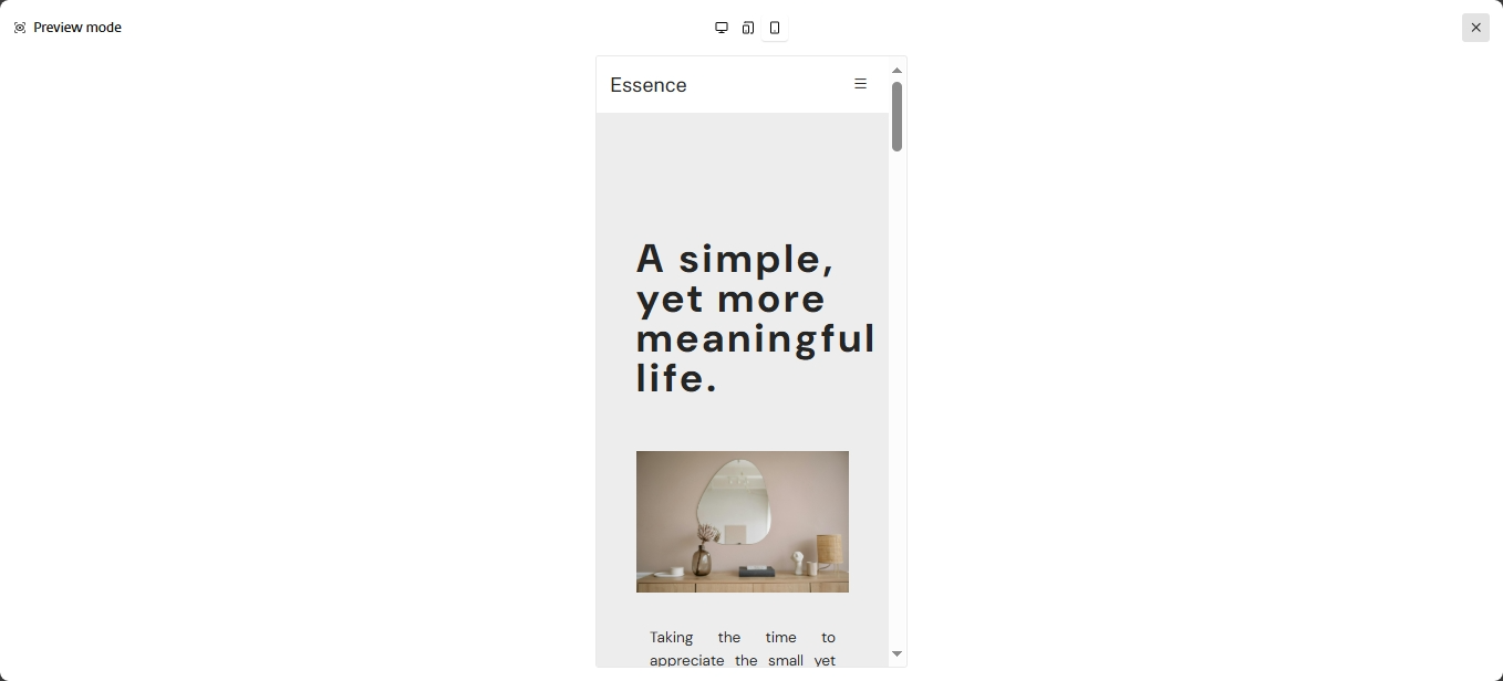
Ensure elements are easy to read and navigate, and that nothing overlaps.
Make Responsive Adjustments
- Reposition or resize elements that don’t fit well on smaller screens.
- Adjust text sizes or spacing for better readability.
- Choose to show or hide specific sections on mobile or tablet if needed.
Previewing your design across devices helps ensure a consistent and professional experience for all visitors.
Use the built-in preview tools to catch and fix layout issues so your site looks great on phones, tablets, and desktops alike.
Related Articles
- Create a Project in DIY Website Builder
- Understanding the Editor Interface
- Customising Your Design
- Adding a New Page in Your Project
- Deploying Your Website
Still Need Help?
If you have any further questions or require additional
assistance, please don't hesitate to reach out to our support
team.